11 min read Tanja
The 10 Best Fonts for Your Resume in 2026 (ATS-Tested)
Job Application Materials
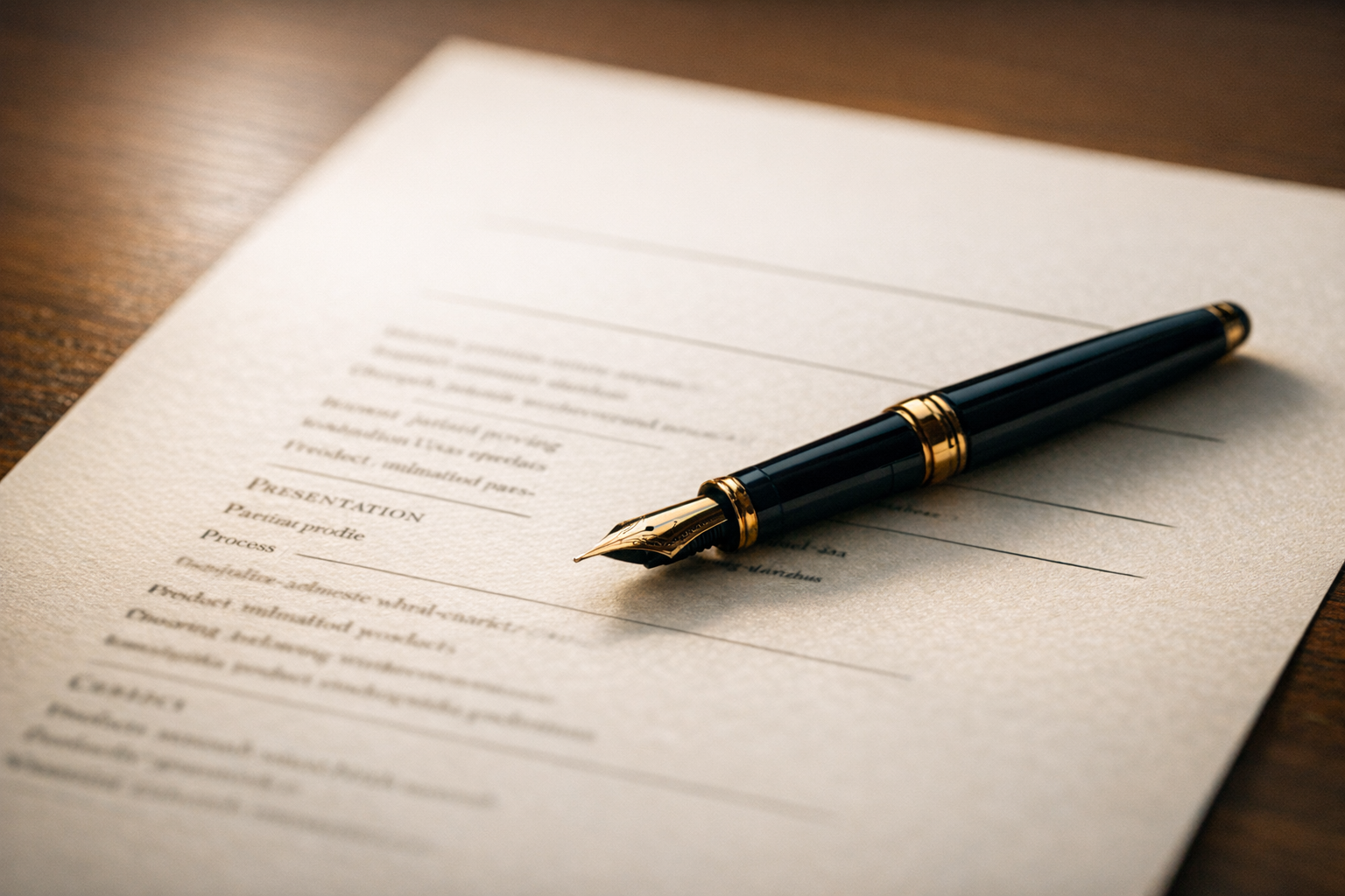
Your resume has about 7 seconds to make a first impression. And before a recruiter even reads a single word, their brain has already processed something else: the typography. The font you choose signals professionalism, attention to detail, and whether you understand modern business norms. Pick the wrong one and your resume looks like a birthday party invitation. Pick the right one and your content gets the attention it deserves.
But there’s a second audience that cares about your font choice even more than recruiters: Applicant Tracking Systems. Over 95% of Fortune 500 companies use ATS software to screen resumes before a human ever sees them. If your font causes parsing errors, your carefully written experience turns into garbled text. Game over.
We tested 10 fonts across major ATS platforms (Workday, Greenhouse, Lever, iCIMS, and Taleo) and evaluated them for readability, professional appearance, and space efficiency. Here are the results.
Type: Sans-serif | Recommended size: 10.5-11.5pt | ATS compatibility: Excellent
Calibri has been Microsoft’s default font since 2007, which makes it the most widely recognized sans-serif in business documents worldwide. Its rounded letterforms are warm without being casual, and it reads cleanly at small sizes on both screens and paper.
Best for: Corporate roles, finance, consulting, administrative positions. Essentially any job where you want to look professional without trying too hard.
Why it works: Calibri hits the sweet spot between modern and neutral. Recruiters see it constantly, which means they never think about it. That’s exactly what you want from a resume font.
Type: Serif | Recommended size: 11-12pt | ATS compatibility: Excellent
Garamond is the font of choice when you want elegance. Its thin strokes and classic proportions give resumes a refined, editorial quality. It also runs slightly smaller than most fonts, which means you can fit more content on a page without shrinking the point size.
Best for: Academia, publishing, law, executive-level positions. Anywhere that values tradition and sophistication.
Why it works: Garamond says “I read books and have taste” without saying it out loud. It’s one of the oldest typeface designs still in regular use, dating back to the 16th century, and it still looks fresh.
Type: Serif | Recommended size: 10.5-11.5pt | ATS compatibility: Excellent
Designed specifically for on-screen reading by Microsoft, Cambria is the modern answer to Times New Roman. It has stronger serifs and wider spacing, which makes it more legible on monitors where most resumes are first reviewed.
Best for: Government, healthcare, education, traditional industries. A safe pick when you’re not sure what the company culture expects.
Why it works: Cambria gives you the authority of a serif font with none of the “stuck in 2005” baggage of Times New Roman. It was literally engineered for the way we read documents today.
Type: Sans-serif | Recommended size: 10-11pt | ATS compatibility: Excellent
Helvetica is the gold standard of graphic design. Clean, precise, and universally respected, it appears in everything from subway signage to Fortune 500 logos. On a resume, it projects confidence and clarity.
Best for: Design, marketing, tech, architecture. Industries where visual awareness matters.
Why it works: There’s a reason graphic designers have a near-religious devotion to Helvetica. Its letter spacing and proportions are close to perfect. One caveat: it’s native to macOS but not Windows, so always export to PDF to preserve rendering.
Type: Serif | Recommended size: 10.5-11.5pt | ATS compatibility: Excellent
Georgia was specifically designed for screen legibility. Its large x-height (the height of lowercase letters) and generous spacing make it incredibly easy to read on monitors, which is where 90%+ of resumes are first reviewed.
Best for: Media, journalism, nonprofits, education. A warm, approachable serif that doesn’t feel stuffy.
Why it works: Georgia is one of the few serif fonts that was designed for digital screens first, print second. This makes it ideal for resumes that will be read on laptops and tablets before they ever see a printer.
Type: Sans-serif | Recommended size: 10.5-11pt | ATS compatibility: Excellent
Arial is the workhorse of business fonts. It’s installed on every computer, renders consistently across platforms, and never causes ATS issues. It’s not going to win any design awards, but it will never cause problems.
Best for: Any industry. When in doubt, Arial is the safest possible choice.
Why it works: Arial is the Honda Civic of fonts. Reliable, ubiquitous, gets the job done. If you’re applying to a company where font choice is the last thing anyone cares about, Arial is your answer.
Type: Sans-serif | Recommended size: 10-11pt | ATS compatibility: Very good
Lato (Polish for “summer”) was designed to feel warm and stable. Its semi-rounded letterforms are more friendly than Arial but more professional than Comic Sans (obviously). It’s a Google Font, meaning it’s free and widely available.
Best for: Tech startups, creative agencies, freelancing, digital-first companies.
Why it works: Lato feels contemporary without being trendy. It’s the font equivalent of smart casual dress code. One note: since it’s not a system font, always embed it in your PDF to avoid substitution.
Type: Sans-serif | Recommended size: 10-11pt | ATS compatibility: Very good
Roboto is Google’s signature typeface, used across Android and Google’s own products. It has a mechanical skeleton with largely geometric forms, but the curves are open and friendly.
Best for: Tech, engineering, product roles, companies in the Google/Android ecosystem.
Why it works: If you’re applying to tech companies, Roboto signals that you live in the modern digital world. Like Lato, it’s a web font, so embed it when exporting to PDF.
Type: Serif | Recommended size: 10.5-11.5pt | ATS compatibility: Very good
Palatino was inspired by Renaissance calligraphy and designed by legendary typographer Hermann Zapf. It’s slightly wider than Garamond with more open counters, making it easier to read at smaller sizes.
Best for: Legal, academic, literary, cultural organizations. A sophisticated choice that stands apart from the crowd.
Why it works: Palatino has a calligraphic elegance that Garamond sometimes loses at small sizes. If you’re in a field where the written word matters, this font tells your reader that you care about the details.
Type: Sans-serif | Recommended size: 9.5-10.5pt | ATS compatibility: Excellent
Verdana was designed by Matthew Carter specifically for screen reading. Its wide letterforms and generous spacing make it one of the most legible fonts at small sizes. This comes with a trade-off: it takes up more horizontal space than most fonts.
Best for: Digital roles, remote positions, anyone with a content-heavy resume that needs maximum readability.
Why it works: If your resume is dense with technical skills and certifications, Verdana ensures nothing gets lost. Just use a slightly smaller point size (9.5-10.5pt) to compensate for its wider characters.
This isn’t the heated debate some articles make it out to be. Both work fine on resumes. Here’s the practical difference:
Serif fonts (Garamond, Cambria, Georgia, Palatino) have small decorative strokes at the end of each letter. They feel traditional, authoritative, and literary. Think law firms, academia, and publishing houses.
Sans-serif fonts (Calibri, Helvetica, Arial, Lato, Roboto, Verdana) have clean, stroke-free letters. They feel modern, approachable, and tech-forward. Think startups, marketing agencies, and software companies.
The real rule: Match the font to the industry. Conservative industries lean serif. Modern industries lean sans-serif. If you’re unsure, Calibri or Cambria are universally safe.
Getting the right size and spacing is just as important as the font itself. Here’s what works:
| Element | Recommended Size |
|---|---|
| Your name | 14-16pt |
| Section headings | 12-14pt |
| Body text | 10-12pt |
| Contact info | 9-10pt |
Line spacing: Set body text to 1.15-1.2 line height. Single spacing (1.0) feels cramped. Double spacing (2.0) wastes space. The sweet spot is just enough breathing room for the eye to track comfortably between lines.
Margins: Keep margins between 0.5 and 1 inch on all sides. Anything tighter and the page feels suffocating. Anything wider and you’re wasting valuable real estate.
Consistency is everything. Use one font family throughout your resume. If you absolutely want variety, pair a serif heading font with a sans-serif body font (like Georgia headings with Lato body text). Never use more than two fonts.
The fundamental rule of ATS compatibility is simple: stick to fonts that come pre-installed on most computers. When an ATS encounters a font it doesn’t have, it substitutes another one. This substitution can break your layout, merge words together, or replace characters with blank boxes.
Always safe: Calibri, Arial, Times New Roman, Georgia, Cambria, Helvetica, Verdana, Tahoma, Trebuchet MS, Garamond, Palatino, Book Antiqua.
Usually safe (but export as PDF): Lato, Roboto, Open Sans, Montserrat, Raleway, Nunito. These Google Fonts work well when embedded in PDFs but may not render correctly in .docx files on the recruiter’s machine.
Never use: Script fonts (Brush Script, Pacifico), decorative fonts (Impact, Papyrus), handwriting fonts (Comic Sans, Kristen ITC), display fonts (Lobster, Playfair Display at body sizes).
If you want to know how well your resume parses through ATS, ResuFit can run an ATS simulation and flag formatting issues, including font problems, before you submit.
Let’s be specific about what to avoid:
Comic Sans - Created for speech bubbles in Microsoft Bob (a children’s software). It signals that you don’t understand professional norms. There is no industry where Comic Sans is acceptable on a resume.
Papyrus - The font James Cameron used for the Avatar logo, which was already controversial. On a resume, it screams “I picked a font that looked cool without understanding why it’s wrong.”
Impact - A display font designed for headlines and posters. It’s condensed, heavy, and exhausting to read in paragraphs. Your resume is not a protest sign.
Brush Script - Cursive fonts are hard enough to read in a greeting card. On a resume, they’re impossible to scan quickly and will confuse every ATS on the market.
Courier New - A monospaced font designed to look like a typewriter. Unless you’re applying for a job in 1975, this communicates “I don’t know how to use a computer.”
If you want your resume to have a polished, designed look, strategic font pairing can help. The key is contrast without conflict:
Classic pairings that work:
Rules for pairing:
That said, you absolutely do not need two fonts. A single well-chosen font in different weights (regular for body, bold for headings) works perfectly and eliminates any risk of visual clutter.
Finance, Law, Government: Cambria, Garamond, or Georgia. These fields value tradition and precision. Serif fonts communicate that you respect established norms.
Tech, Startups, Engineering: Calibri, Roboto, or Lato. Clean, modern sans-serifs that signal you belong in a forward-looking environment.
Healthcare, Education, Nonprofits: Calibri or Georgia. Readable, warm, professional without being corporate.
Creative, Design, Marketing: Helvetica, Lato, or a well-chosen Google Font. These industries appreciate typographic awareness, but don’t overdo it. Your portfolio shows your creativity, not your resume font.
Applying to multiple industries? Calibri is the universal safe choice. It works everywhere, offends nobody, and lets your content do the talking.
Your font choice won’t get you hired. But the wrong font can definitely get you rejected, either by confusing an ATS or by making a recruiter question your judgment. Choose a clean, professional, ATS-compatible font in the right size, keep your formatting consistent, and spend the rest of your time on what actually matters: the content.
If you’re building a resume from scratch or want to make sure your existing one passes ATS screening, ResuFit handles font selection, formatting, and ATS optimization automatically. It takes about 3 minutes and eliminates the guesswork entirely.
Related reading:
Ready to build a winning resume?
Create Your Resume FreeGet the latest tips on resume writing and career advice.
Calibri, Garamond, and Cambria are the top choices. They're ATS-compatible, highly readable, and professional. Avoid decorative fonts entirely.
Use 10-12pt for body text and 14-16pt for your name. Section headings work best at 12-14pt. Never go below 10pt.
It's ATS-safe but looks dated. Modern alternatives like Cambria or Georgia give the same traditional feel with a more contemporary look.
Yes. Stick to standard fonts installed on most systems. Custom or decorative fonts can cause ATS parsing errors, scrambling your resume content.